This blog is by Tran Quang Hung. It was originally published on Students 4 Best Evidence, a blogging platform by students for students.
The evidence-based healthcare house begins with single-study bricks.
With time, the bricks accumulate. More and more research is conducted. Both observational and interventional.
If enough similar single studies in a given field are conducted, the past results can be combined. And boom. We get a new result – more reliable – with a combined population, bigger than any prior population. This is known as a meta-analysis.
In this kind of study, we often see a graph, called a forest plot, which can summarise almost all of the essential information of a meta-analysis.
Let’s find out how to read a forest plot.
Pros and cons of a forest plot
There are 3 main things we need to assess when reading a meta-analysis:
- Heterogeneity. The differences in the results, methodology or study populations used in the included studies.
- The pooled result. The overall combined result derived from combining (‘pooling’) the individual studies.
- Publication bias. Although the intent of a meta-analysis is to find and assess all the relevant studies meeting the inclusion criteria, this mission is not always possible. Some studies can be missed because they are not written in English, or because they show non-significant results (so they have a lower chance of being published).
A forest plot does a great job in illustrating the first two of these (heterogeneity and the pooled result). However, it cannot display potential publication bias to readers. A funnel plot can do that instead.
How to read a forest plot
Often, we have 6 columns in a forest plot.
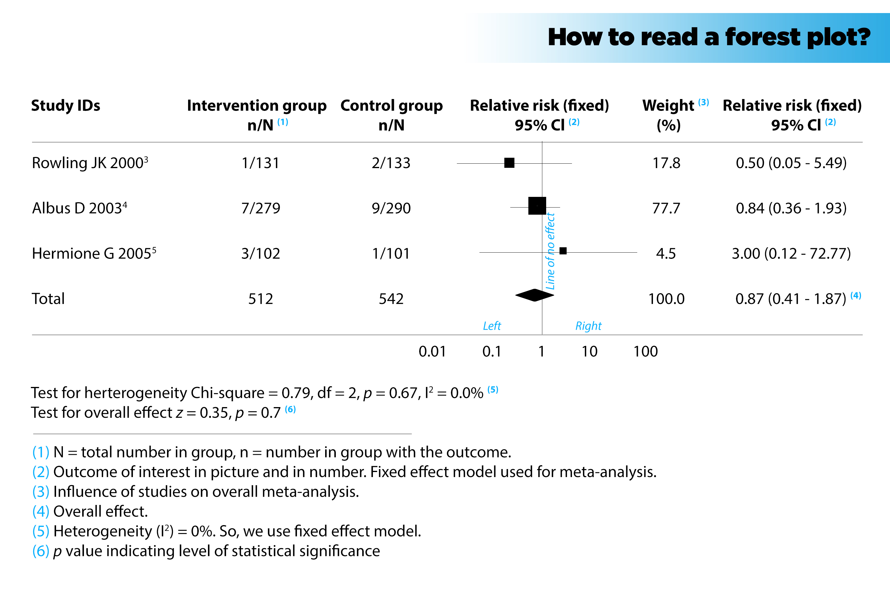
Column 1: Studies IDs
The leftmost column shows the identities (IDs) of the included studies. Studies are represented by the name of the first author and the year of publication, often arranged in time order.
Column 2 and column 3: Intervention group n/N and Control group n/N
Next, to the right, we meet some data from the intervention group and the control group from each study.
n indicates the number of patients having the outcome of interest, while N represents the total number of patients in that group.
For instance, in the study of Rowling et al (2000), 1 out of 131 participants in the intervention group has the outcome of interest, compared with 2 out of 133 participants in the control group.
Column 4: Relative risk (fixed) 95% CI
The next column visually displays the study results. The boxes show the effect estimates from the single studies, while the diamond shows the pooled result.
The horizontal lines through the boxes illustrate the length of the confidence interval. The longer the lines, the wider the confidential interval, the less reliable the study results. The width of the diamond serves the same purpose.
The vertical line is the line of no effect (i.e. the position at which there is no clear difference between the intervention group and the control group).
If the outcome of interest is adverse (e.g. mortality), the results to the left of the vertical line favour the intervention over the control. That is, if result estimates are located to the left, it means that the outcome of interest (e.g. mortality) occurred less frequently in the intervention group than in the control group (ratio < 1).
If the outcome of interest is desirable (e.g. remission), the results to the right of the vertical line favour the treatment over the control. That is, if result estimates are located to the right, it means that the outcome of interest (e.g. remission) occurred more frequently in the intervention group than in the control group (ratio > 1).
The last possibility: if the diamond touches the vertical line, the overall (combined) result is not statistically significant. It means that the overall outcome rate in the intervention group is much the same as in the control group. This is the case in the figure above.
Column 5: Weight (%)
For the next column over, the weight (in %) indicates the influence an individual study has had on the pooled result. In general, the bigger the sample size and the narrower the confidence interval (CI), the higher the percentage weight, the larger the box, and more the influence the study has on the pooled result.
Column 6: Relative risk (fixed) 95% CI
The rightmost column contains exactly the same information as is contained in the diagram in column 4, just in numerical format. So, we can observe the data both in picture and in number. This can be either the 95% CI of odds ratio (OR) or the 95% CI of relative risk (RR).*[See the bottom of this blog for a brief explanation of the difference]. The diagram above shows relative risk. When the 95% CI does not include 1, we can say the result is statistically significant.
More information is found at the lower left corner of the plot.
The p-value indicates the level of statistical significance. If the diamond shape does not touch the line of no effect, the difference found between the two groups was statistically significant. In that case, the p-value is usually < 0.05.
The I^2 indicates the level of of heterogeneity. It can take values from 0% to 100%. If I^2 ≤ 50%, studies are considered homogeneous, and a fixed effect model of meta-analysis can be used. If I^2 > 50%, the heterogeneity is high, and one should usea random effect model for meta-analysis. The difference between homogeneity and heterogeneity therefore lies in the different approaches taken to calculate the pooled result.
***
So, we’ve reached the end of the ‘how to read a forest plot’ tutorial.
Hope it helps.
Feel free to leave comments if you are still confused about forest plots.
***
[You can read more about the difference between odds and risk ratios here under the ‘odds ratios and relative risks’ section or here. But briefly, odds ratio is the number of participants in the group who achieve a stated end-point divided by the number of patients who do not. Risk ratio, as opposed to odds ratio, is the number of participants in the group who achieve the stated end-point divided by the total number of patients in the group].
All the images in this blog have been created by mitis
Read more of Tran’s blogs here…
Efficacy of drugs: 3 examples to get you to truly understand Number Needed to Treat (NNT)
How did they determine diagnostic thresholds: the stories of anemia and diabetes
Key to statistical result interpretation: P-value in plain English
Surrogate endpoints: pitfalls of easier questions